
Our last post demonstrated four specific elements of visual bias in the Europe referendum ballot paper resulting from the recommendation of the Electoral Commission and as approved by Parliament (Statutory Instrument 2016, No 219 page 103).
It also illustrated bias in the Electoral Commission's own written proposal.
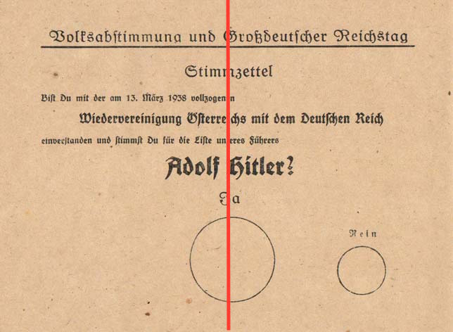
This post goes further: it points to specific similarities between the Europe referendum ballot paper and that used to secure 99.7% support in Hitler's 1938 referendum to endorse the incorporation of Austria into Germany.
Hitler's referendum was of course the act of a dictator on a roll: there was no need for any subtlety in the signals given by the ballot paper.
The Europe referendum paper incorporates some of the same characteristics but these will not immediately be obvious to the voter whose eye is drawn, for reasons not fully understood in the ballot box, to "Leave": it is therefore a fraud on the British people.
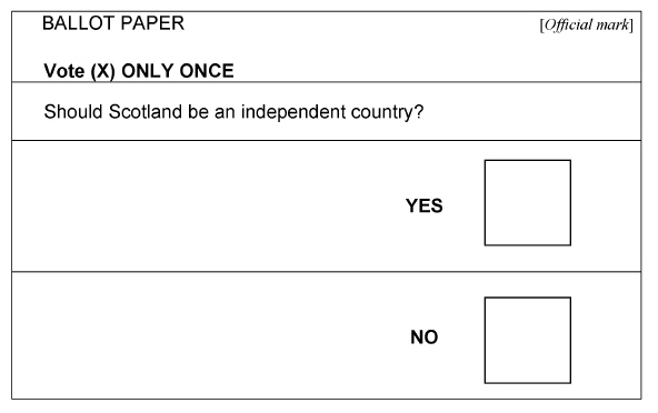
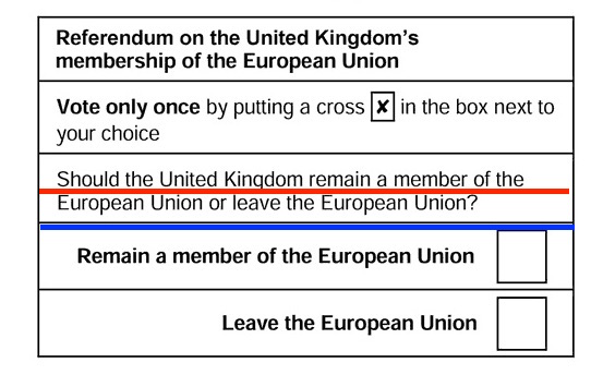
Before we make these comparisons, we illustrate what we think is a good referendum ballot paper: Scotland's in 2014. It is clear, concise (8 words to the Electoral Commission's 51) and neutral:-
It also illustrated bias in the Electoral Commission's own written proposal.
This post goes further: it points to specific similarities between the Europe referendum ballot paper and that used to secure 99.7% support in Hitler's 1938 referendum to endorse the incorporation of Austria into Germany.
Hitler's referendum was of course the act of a dictator on a roll: there was no need for any subtlety in the signals given by the ballot paper.
The Europe referendum paper incorporates some of the same characteristics but these will not immediately be obvious to the voter whose eye is drawn, for reasons not fully understood in the ballot box, to "Leave": it is therefore a fraud on the British people.
Before we make these comparisons, we illustrate what we think is a good referendum ballot paper: Scotland's in 2014. It is clear, concise (8 words to the Electoral Commission's 51) and neutral:-
We first consider horizontal bias.
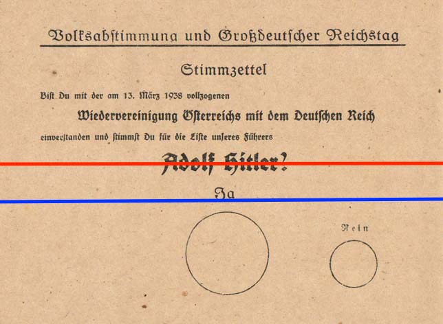
In Hitler's referendum, "positive" words are within the horizontal centring line: "Ja", "Adolf Hitler", "our", "Austria", "Greater Germany":
In Hitler's referendum, "positive" words are within the horizontal centring line: "Ja", "Adolf Hitler", "our", "Austria", "Greater Germany":
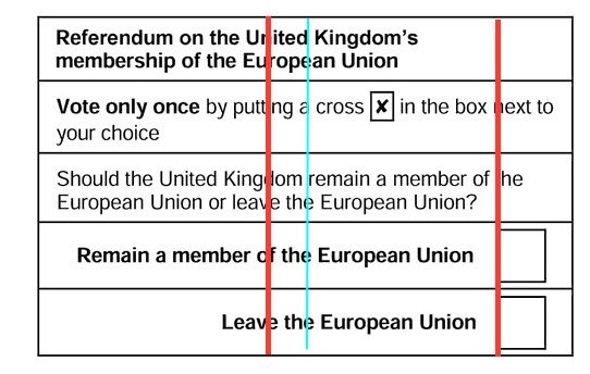
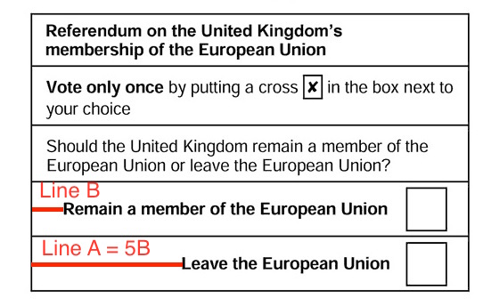
A similar effect, as shown by the two strong red lines, is achieved in the Europe ballot paper, especially if the right margin is taken as an extension of the strong vertical line created by the two boxes and which bounds nearly all the text the voter will read. The thin blue line shows the weaker effect of taking the edge of the form as the margin:-
On Hitler's ballot paper, the undesired outcome "Nein" is pushed towards the horizontal margin. Similarly, in the Europe referendum, "leave"/"Leave" look and are much closer to the centre than "Remain" an effect enhanced by "leave" being as directly above "Leave" as the different typeface allows.
While the "Nein" is further de-emphasised by being much smaller, "Remain" as discussed in our last post is diluted by being much more entangled in surrounding text: "Leave" stands out.
Staying with horizontal bias, the Europe referendum ballot is much worse - getting on for twice as bad - as Hitler's in use of emphasising clear space to the left of the "desired" outcome. The Electoral Commission has repeatedly fail to explain this orientation:-
Vertical bias - again creating more space and prominence for the "Leave" choice - was briefly discussed in our last post and is clearly strong in the ballot paper.
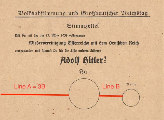
Although the vertical similarities with Hitler's ballot paper are not quite as marked, there are some.
In the Hitler ballot, the star of the show is vertically centred, as shown by the strong red line. Looking at the "golden ratio" of the vertical component of the page, the desired outcome "Ja" falls on it as shown by the strong dark blue line. And the centre of the "Ja" voting circle is about 80% of the way down the page, fairly close to the centre of the component below "Ja":
On the Europe ballot paper, the centre red line effect is not as strong: however it is closer to the reference to "leave" than to "remain", and this is exacerbated by the horizontal centring as above: again, "leave" looks as though it is in the middle of the paper.
Equally the golden segment effect is not as strong: but it is closer to "leave" than to "Remain" and "leave" is prominent through its proximity.
"Leave" is about 90% of the way down the form, just about within the vertical area of the "Ja" circle and , with the adjusted right margin, in exactly the same horizontal position: although the correlation is greater on adjusted horizontal alignment there is also correlation on vertical alignment.
 RSS Feed